Here is how you build a trustworthy ecommerce site, part three

In the previous post, we discussed the simple and practical things website owners can do when they want to gain the trust of their visitors. That’s a wonderful step to take, but if you’re in ecommerce, you need them to buy from you.
Visitors who don’t buy are costly to websites. In fact, according to Business Insider, roughly $4 trillionworth of merchandise will be abandoned in online shopping carts this year. But the kicker is, that problem turns out to be a huge opportunity: the same study found that 63% of those abandoned carts are recoverable—but only to clever marketers.
In this post, we’ll show you the steps you can take to make sure you don’t lose sales to cart abandonment, and how to convince visitors to take that leap of faith into becoming paying customers.
1. Show them what they’re buying and tell them what it costs
Your job is to make sure there are no surprises. Your product pages should have quality images, include product specs, and reviews and ratings. Give people multiple views of the item and if at all possible, show a video.
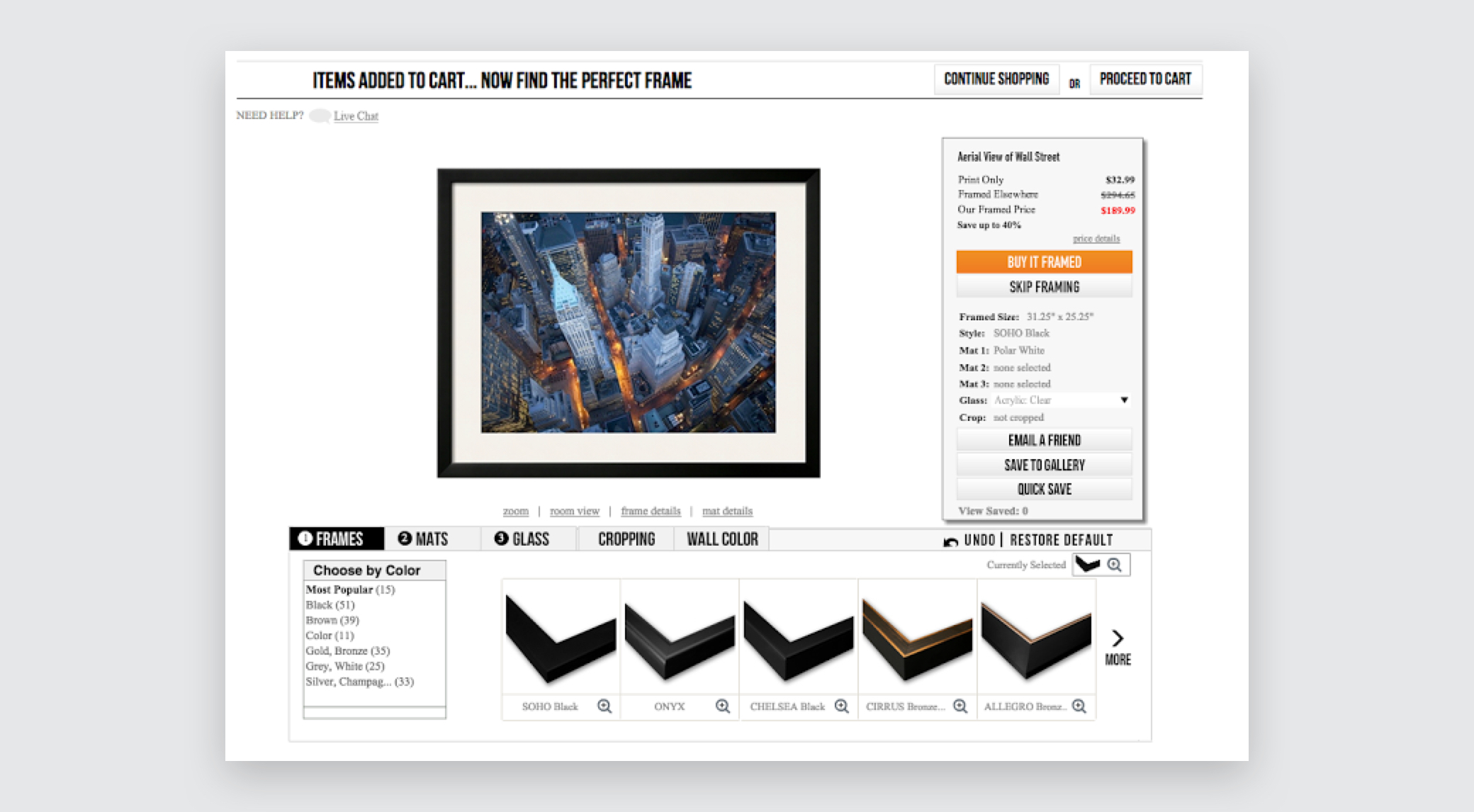
Art.com which lets you choose a piece of artwork then frame it, all within the product page—a great way of letting customers visualize what they’re getting.
Above all, let them know how much it will actually cost—that means including shipping information on product pages and throughout the purchase funnel so they don’t experience sticker shock when they hit the end.
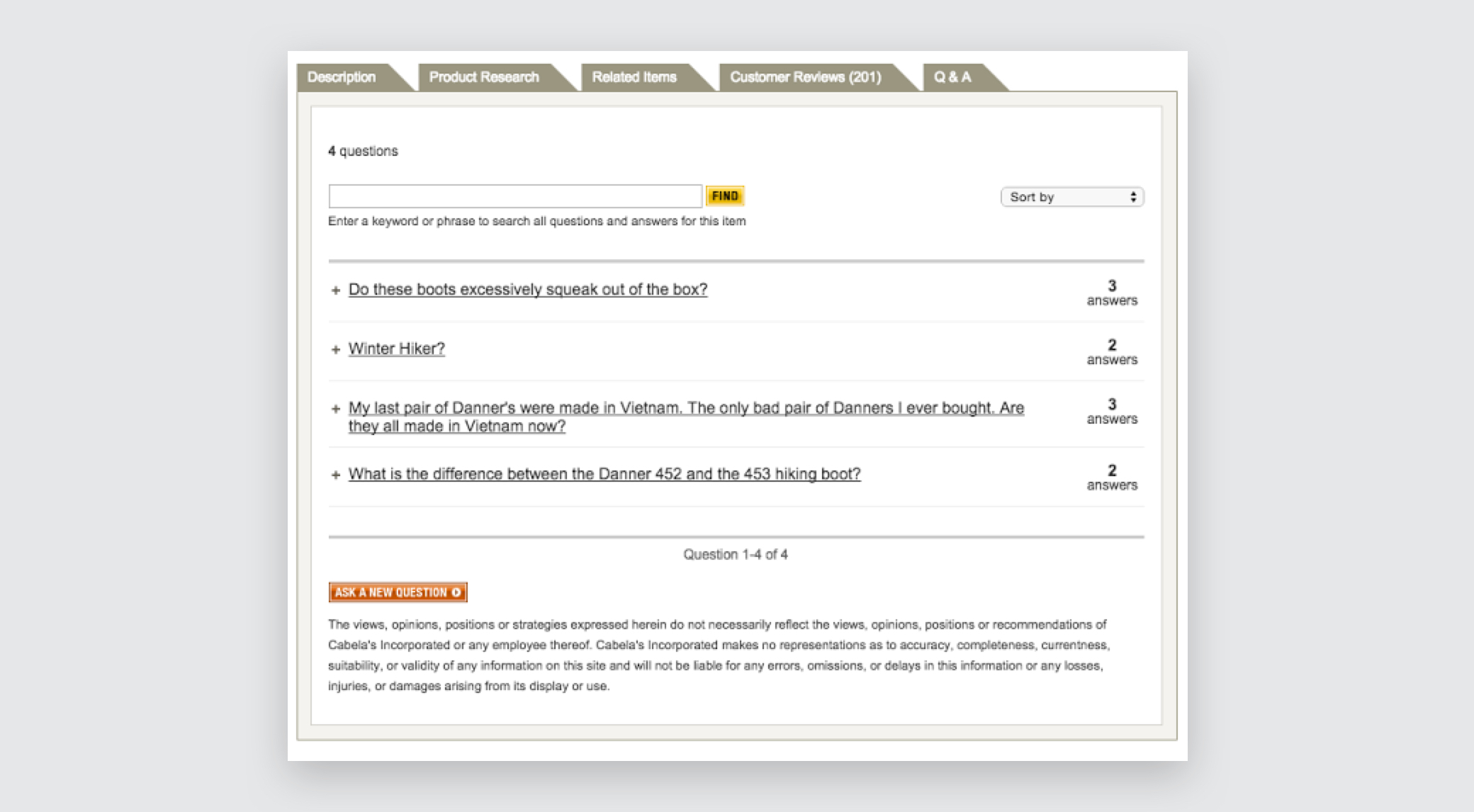 Cabela’s does a fantastic job including customer reviews and a Q&A section on their product pages.
2. Make Customers Feels Safe
It’s important for customers to feel safe throughout the buying process—particularly when you ask for their personal and financial information. There are several essentials that every website should include, not least of which is a security seal. These demonstrate that your site is secure—especially when it comes to forms.
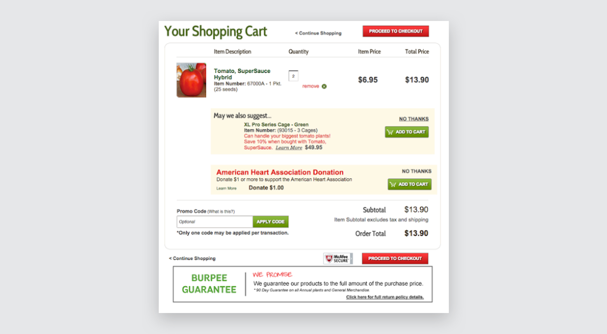
Burpee.com uses the McAfee SECURE engagement trustmark throughout their shopping and checkout process to great effect.
3. Give Them All The Information They Need
Another common cause of shopping cart abandonment is when people are left with unanswered questions: When will this arrive? Is it returnable? Is shipping included in the price?
Make it easy for customers to get help by including live chat, email or phone number during the checkout process and on product pages.

Tory Burch has live chat available throughout the shopping and purchase process.
Make sure it’s easy for customers to see information about your security, privacy, and return policies. The customer is taking a risk by purchasing from you. If they’ve never done so before, it helps them to know what to expect.
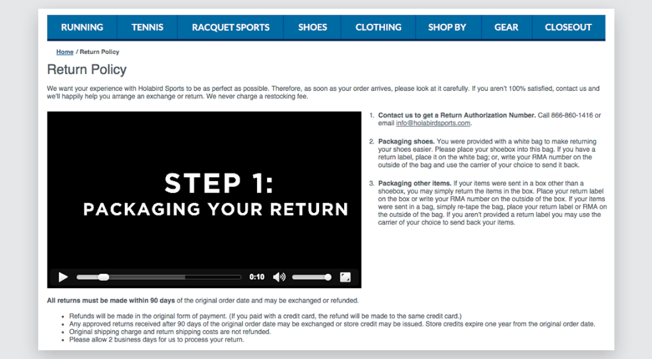
Hola Bird has a video on how to return items that is clear and simple.
When checking out, everything should be clear. Include a list of all your order information at checkout. Be clear so people know what to expect and what they’re getting.
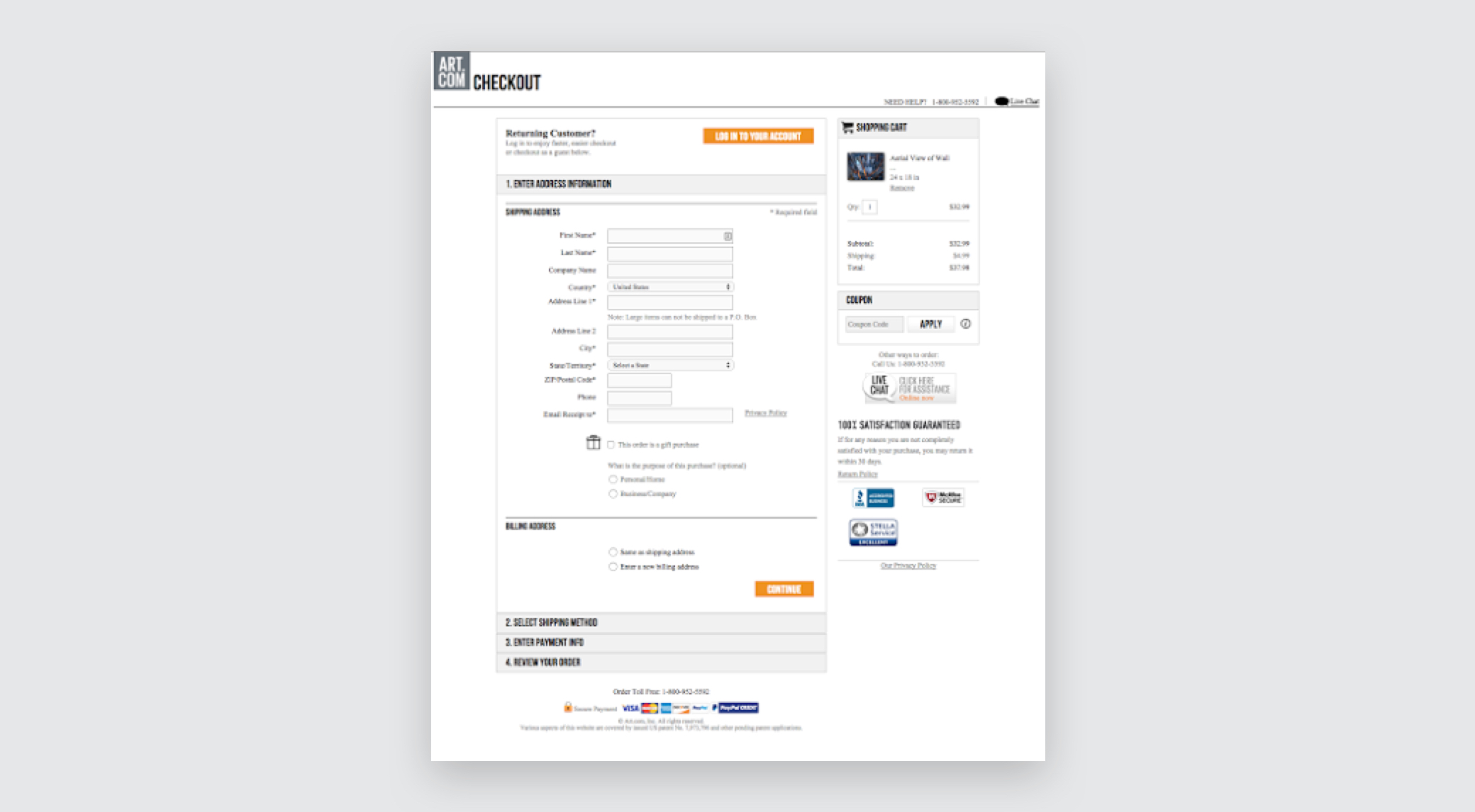 Art.com’s checkout does a wonderful job of including all information a customer could want.
Include breadcrumb navigation, so they know how many steps in the checkout process.
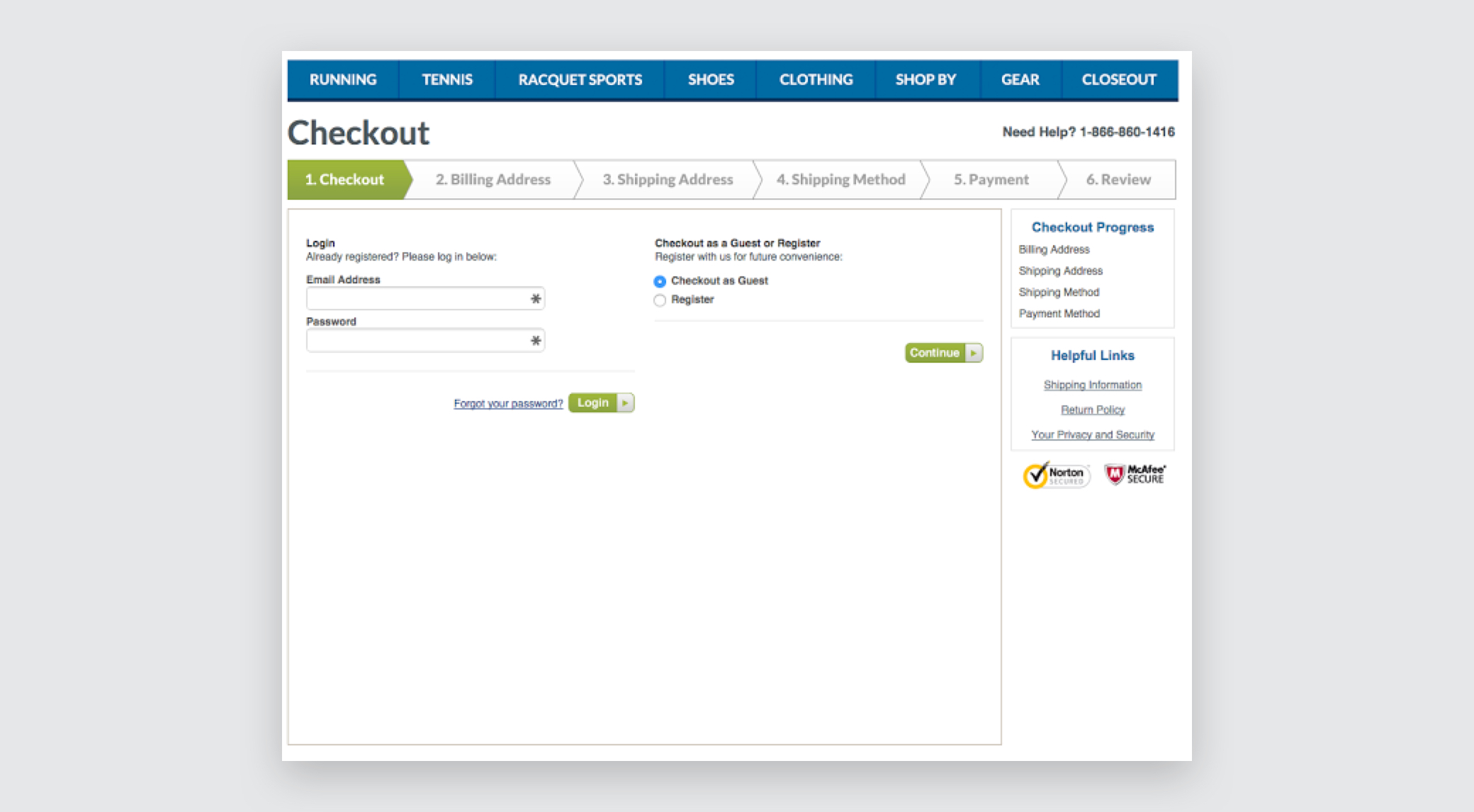
Hola Bird’s checkout process makes it very easy for the customer to understand what’s expected of them.
OK, that’s it! If you’ve followed the steps in this post (and in parts one and two), you should be well on your way to having a trusted ecommerce site. Happy web designing, everybody!