What verticals have the highest bounce rates and what you can do about it

Have you ever walked into a restaurant and immediately realized you don't want to stay and order anything?
That happens with websites, except a lot more frequently. The question is: Why? Which industries have the highest bounce rates? And what can you do to get visitors to stay on your site?
First things first: what is a bounce rate?
According to Google, a “bounce” is a single-page session on your site. This means that a person visits your website and leaves without any interaction whatsoever. Like that restaurant customer, it's someone who quickly saw the page they landed on and thought “nope…not for me.”
Here are the events that can be defined as a bounce, according to ConversionXL:
- Returning to search results
- Closing the browser
- Entering a new URL in the address bar
- Following an outbound link
- Staying inactive and timing out the session
- Reading the entirety of a page but not triggering any events, and then leaving
A landing page has no value if visitors don’t engage further because, ultimately, that's what it's all about. If one of the earliest parts of your sales funnel is a dead end for a lot people, it's a problem.
Even so, there are some situations where it's not so bad.
High bounce rate isn’t always negative
A bounce rate should be looked at on a case-by-case basis. Namely, there are two prominent times where a high bounce rate shouldn't concern you:
Blogs: Blogs have a relatively high bounce rate because a well-written post will satisfy users with the content alone. There's typically no need for users to further engage with the site. Most importantly, since people tend to land on a blogs through social media links, they’re most likely to return to the social media page after they have finished reading. This behavior makes high bounce rates almost inevitable, and not at all a sign of failure.
Informational/reference pages: The information page is a classic example of a page that Google Analytics marks as a bounce. Once users get the information they’re looking for, their next step is to exit from the site. An example of this may be the contact information page or an FAQ page. Even popular reference sites like Wikipedia have high bounce rates (unless of course, you're like me and fall victim to the infamous wikipedia rabbit hole).
Bounce Rates by Website Type
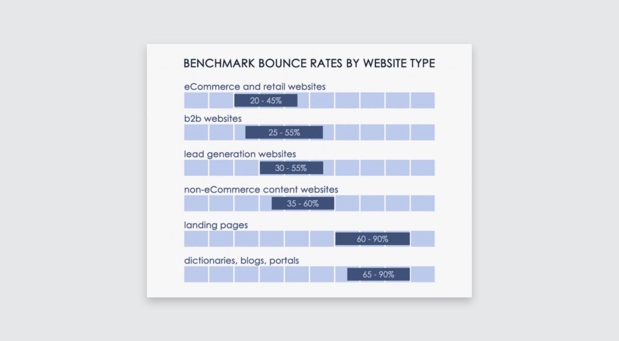
When analyzing your website’s own performance, it's important out where you fall among your peers. For example, if you're an ecommerce site, don’t compare yourself to a blogger.
The below infographic from ConversionXL identifies the expected bounce rates for different website types.

Bounce Rate by Industry
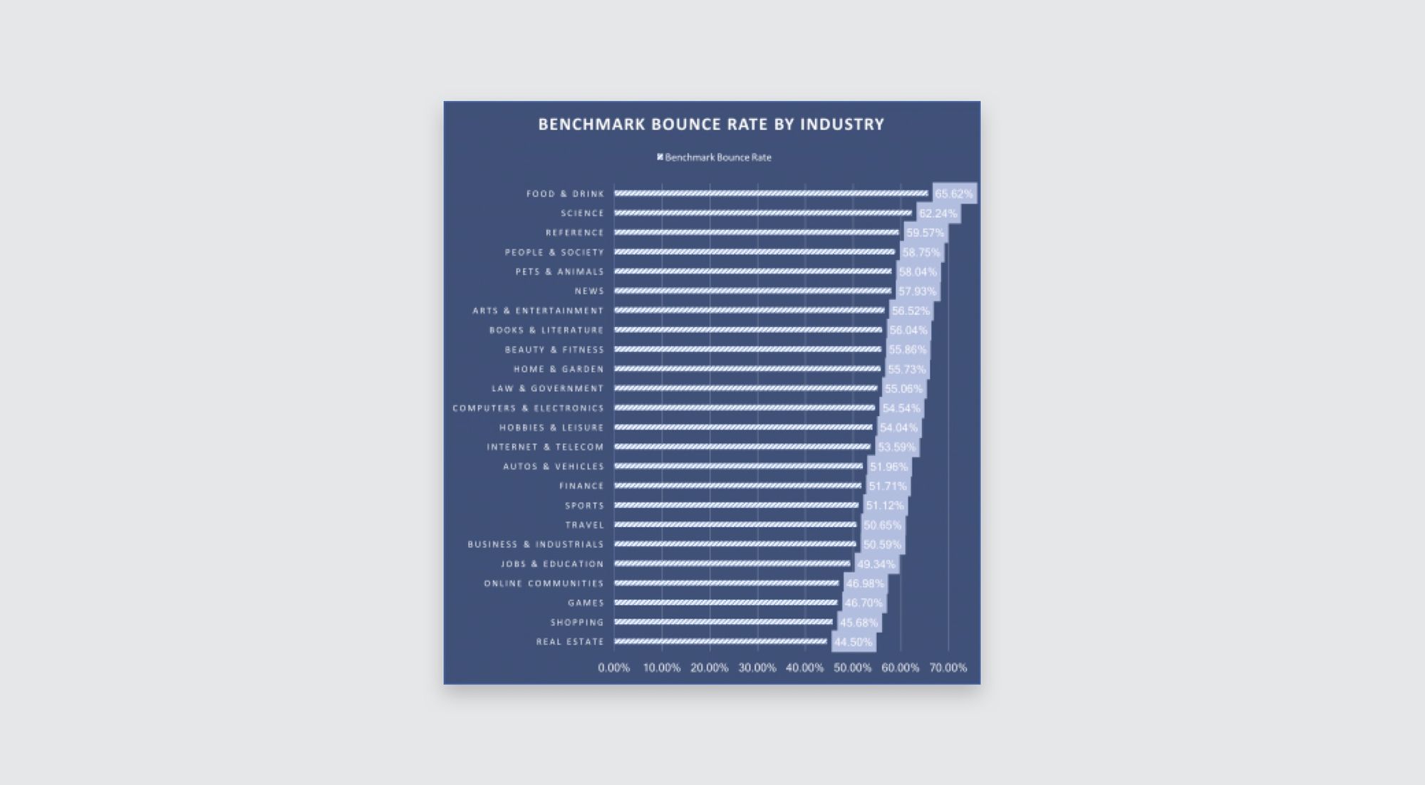
Another way to stay accurate in your bounce rate estimates is to understand what industry you operate in.

When looking at this chart, you'll notice the stark differences between bounce rates in certain industries. Take the food & drink industry versus the shopping industry— a difference of more than 20%.
A restaurant’s website is straight to the point with information on location, hours, phone number, and menu. Most users exit the website after finding the information they’re looking for.
On an ecommerce site, you would expect the bounce rate to be pretty low as visitors shop around and hopefully end up in the cart and checkout process. If users are immediately bouncing from your ecommerce site it may be because your site didn't have the type of product they were looking for, or in a worse scenario, maybe there's something else going on with your site design or navigation.
Most Common Reason Why Visitors Bounce
Kickofflabs compiled a list of 14 reasons users bounce from websites. The top reasons include:
- Slow page load times: People tend to give up after waiting for more than 4 seconds for a page to load. If there's something slowing down your site, fix it, and fix it fast.
- Intrusive advertisements: We've all visited a website only to be bombarded by pop-up ads within the first few seconds of landing on the site. These intrusive ads leave a bad taste in the visitors mouth, are distracting and can actually make a visitor lose trust in your site, causing them to bounce.
- Unexpected and unrelated content: If someone clicks on an ad about fitness and nutrition and then lands on a page that actually promotes dietary supplements, they may feel confused and mislead. If your ads do not match up with the content on your landing page, the visitor will likely lose trust in your business and quickly exit the site. Make sure you're promoting what it is you're actually selling!
How to reduce bounce rates
Keep your landing page layout simple. Visitors want to find what it is they came to your site for in a short about of time. If you're experiencing higher than average bounce rates, consider removing some of the following from your site.
- An overwhelming navigation menu: Avoid the temptation to provide a link to every to every page in your site. Your nav bar should be a table of contents, not an entire index.
- Multiple calls to action: On a given page, there's always one thing you want customers to do more than anything else. Make that your CTA.
- Large, desne chunks of text: It's a lot easier to read one or two lines than five or six. Break up those paragraphs!
- Annoying ads and popups: Whether it's a modal window offering a change to "spin the wheel" or a "Don't leave! Here's 10% off!", pop-ups are almost universally hated.
- Irrelevant content: Like a crowded nav bar, information where it doesn't belong can distract visitors causing them to bounce. Keep your biography in the "About" section, please.
- Too many internal links: Modern design is trending towards clean, simple sites. Show your shoppers what they want, not everything they could want.
- Chat windows: It's nice to be able to chat to a human when we need help, but it's less nice when a chat box pops up, asking us to chat unprompted.
- Autoplay videos: Not. Even. Once.
Your main focus should be on what you really want the visitor to do on your landing page. Make sure all text, images, and call to action buttons have a purpose, are prominently displayed, and nudge people in the right direction.
Visitors will scan your landing page to see if you have what they came for. Your goal is to help them find whatever they need quickly, otherwise they may quickly bounce.
Wrapping up
Improving your bounce rate means a more engaged audience and more conversions. To get visitors to engage with your content, be sure to improve your site’s readability and imagery. The goal is to keep it simple and to keep improving your customers' experience.