14 tips to create a high-converting ecommerce landing page

We know how hard you’ve worked to get people to your ecommerce landing page.
You’ve put ads on Facebook and Google, you’ve sent out email after email, and your effort has eventually paid off. Your landing page is getting tons of new traffic.
But there’s a problem: that traffic isn’t converting into customers.
If this situation sounds familiar, don’t worry. You’re not alone in the struggle to create a high-converting ecommerce landing page. So, don’t let all that effort that you put into getting new traffic go to waste.
If you want to find out how to transform your landing page into a money-making machine, keep reading. We’re going to discuss 14 essential ways to build a high-converting ecommerce landing page.
1. Hyper-Personalize Your Landing Page
Of all the people that land on your landing page, how many are ready to convert?
This will depend on various factors, including how visitors got to your landing page in the first place.
Are these visitors still in the consideration stages of buying? Are they nearer to the end of the marketing funnel? Or, have they just entered the discovery phase?
Consider your audience. If you’re using SEM to get traffic to your website, find out the intent of the keywords you’re targeting. Which stage of the buyer journey best fits the people who are searching for those keywords?
Also, take into account other channels. For example, what kind of audience is coming from your Facebook ads? Are they aware of a problem and considering different solutions?
What about your email campaigns? Who is receiving these emails? Are they newsletter sign-ups who have yet to make a purchase, or are they people who have purchased from your company in the past?
Using these questions, you can tailor your landing page to the specific people that are coming in, matching your copy to where they are in the buyer journey.
By creating landing pages that are targeted to your specific buyer personas, you could increase your conversion rates significantly.
2. Include Personal Value in the Headline
Enticing visitors with a catchy headline is an essential part of getting them to keep reading. So, don’t focus on your product or your company: focus on how visitors will personally benefit from that purchase.
For example, one landing page selling vacations to Orlando tested a benefit-focused headline and saw excellent results.
Their original headline, “Universal Orlando Resort”, was lacking in excitement and wasn’t generating enough conversions.
The headline was changed to “Enjoy 14 Days of Unlimited Access to both Universal Studios® and Universal Islands of Adventure®.”
This simple but effective change increased that page’s conversion rate by 24%.
Telling people immediately how they will benefit from purchasing gives them a much greater incentive to convert.
With simple, clear language, your landing page should convey to the visitor exactly what they stand to gain.
3. Build a Sense of Urgency with Expiring Promotions
Urgency moves people to action. Just think about how much money companies rake in on Black Friday and you’ll be convinced.
Making people feel that they have limited time to act, whether because of an expiring promotion or the scarcity of the product, moves them to convert.
But there’s a catch: if people perceive your landing page’s urgency to be a sales tactic, this has been shown to decrease people’s interest in your product. It also lowers people’s trust in your brand, which is sure way to lower your conversion rate.
So, how can you create a genuine sense of urgency? Check out how Booking.com does this:
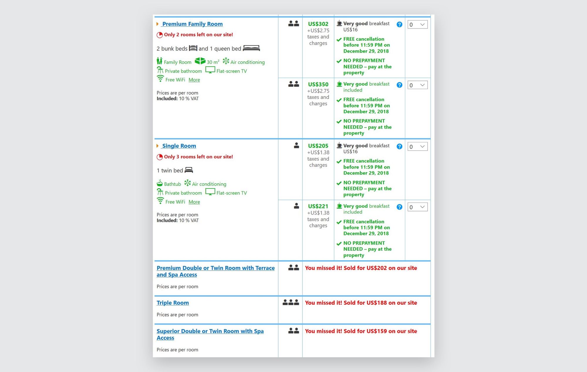
See that bright red lettering? Each hotel page shows how many rooms are left, as well as showing you the rooms that are now sold out for your dates.
This helps create a genuine sense of urgency because people really do need to book fast before the rest of the rooms are sold out.
In order to follow through with this sense of urgency, make sure visitors understand:
- The details of the expiring promotion
- How long they have to act/how many products are left
- What benefit they’ll receive from making this purchase
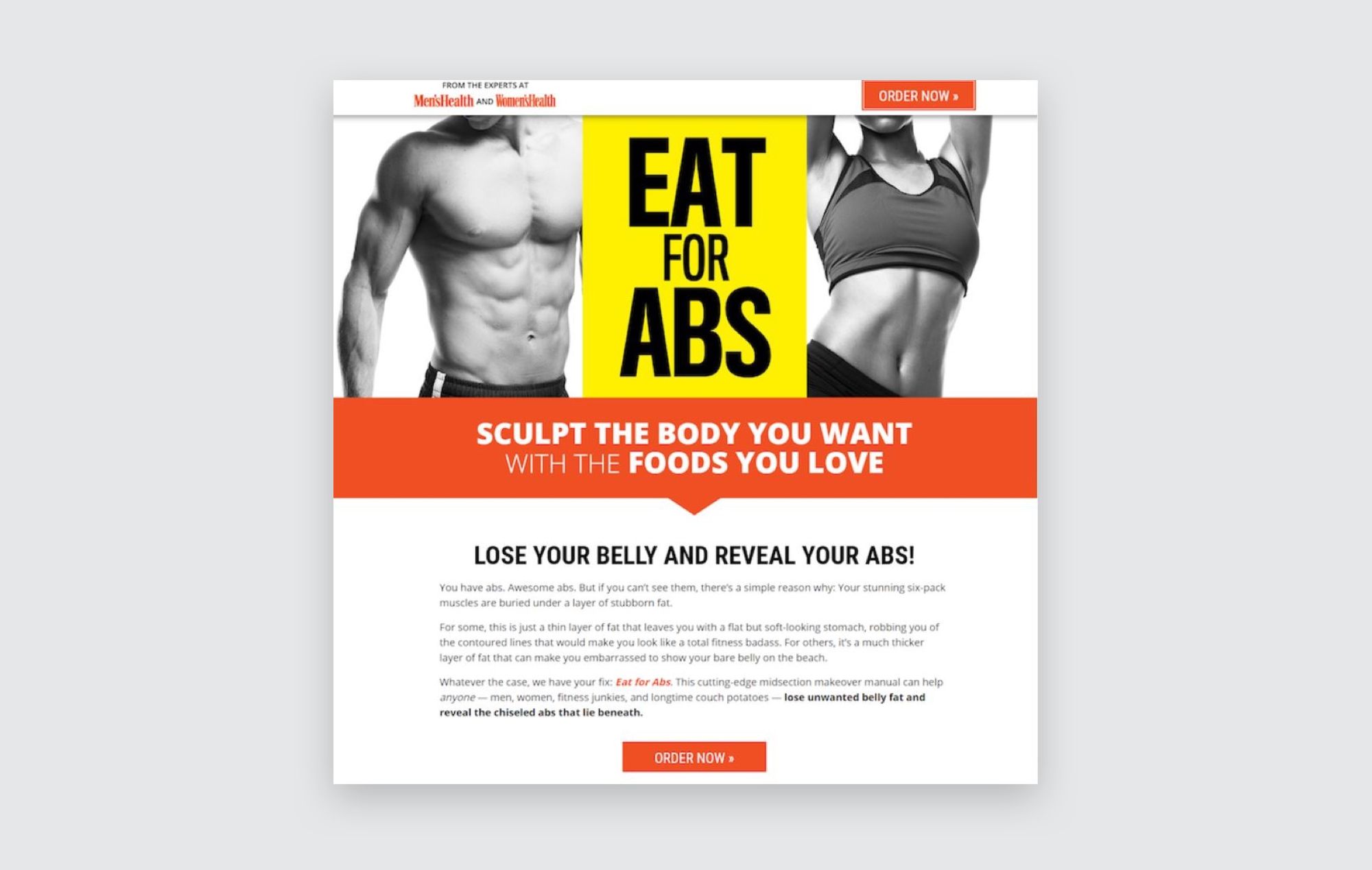
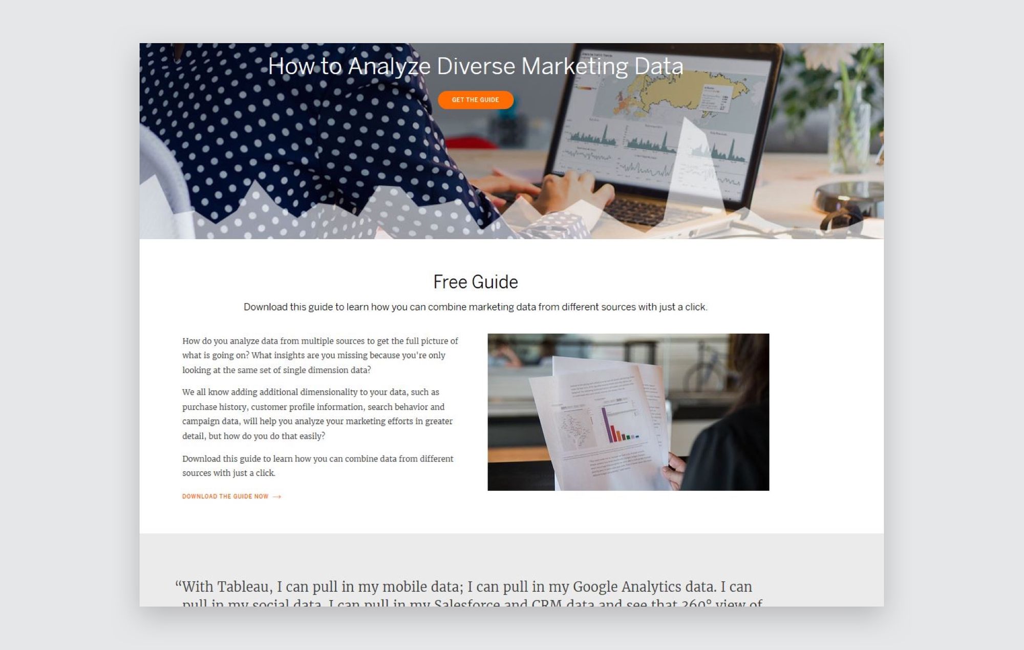
4. Create Visual Flow to Your CTA
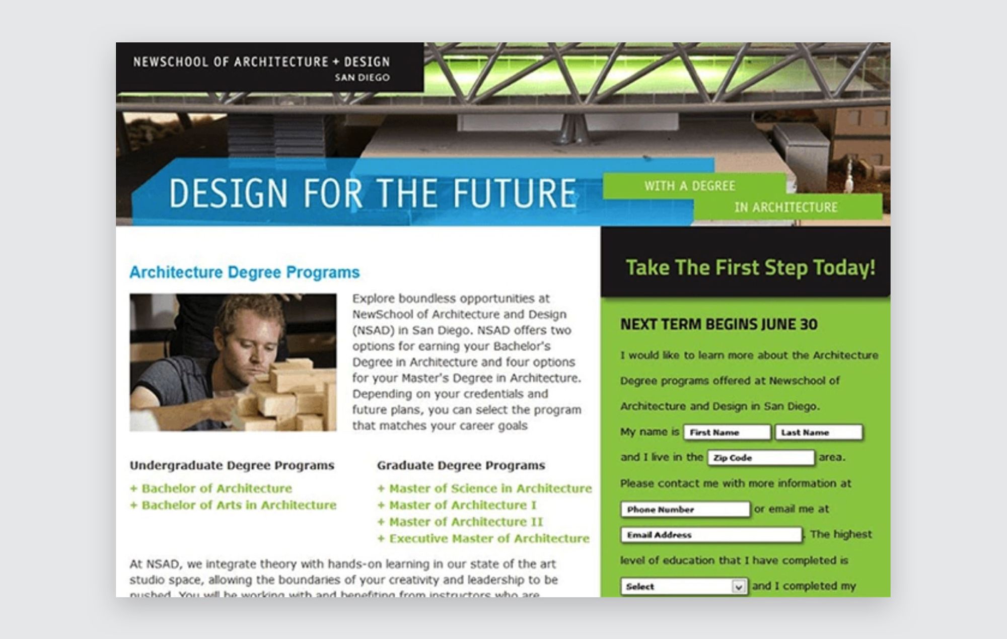
Cramming your page with information horizontally across the page doesn’t create a visual flow. In fact, this kind of design can overwhelm visitors, causing them to backpedal out of your landing page.
If your landing page looks something like this, it’s time to update the design:
Instead, create a simple, downward flow that leads users visually to your CTA button, like this page:
This one even has arrows, drawing your eyes down through the information to the CTA.
People don’t like to read a lot of text, and paragraphs with 10 lines and no breaks aren’t good for skimming to find important information.
Creating a visual flow that naturally takes users eyes towards your CTA will help more people to convert.
5. Replace Site Navigation with Anchor Links
The purpose of your landing page isn’t to get people to your website.
Once a visitor lands on that page, the goal is to get them to convert. In that case, it’s much better to remove site navigation from your landing pages.
Check out how Doodly does this on one of their landing pages:
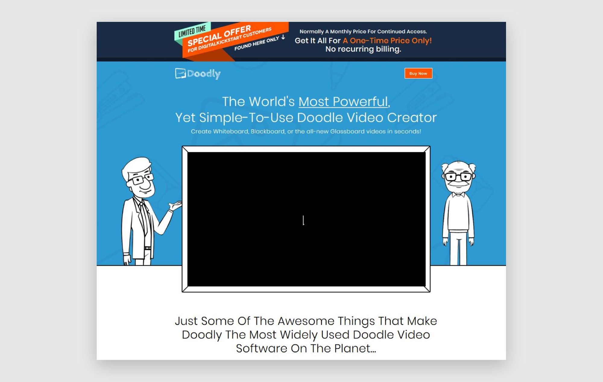
This clean, navigation-free landing page gets visitors to concentrate on making that purchase.
However, that doesn’t mean you should remove all links. To get people to your CTA faster, you can create anchor links that bring people from wherever they are on the page straight to your CTA button.
6. Include Multiple CTA Buttons
Wherever the user is on your landing page, a CTA button should be visible to them.
Why? Because you never know at what point they’ll be convinced to make a purchase. At the moment they decide to buy, you want to make sure that they have a CTA button available to them.
Check out how this landing page uses a header to feature their CTA button right at the top of the page:
7. Go Above and Beyond the Average Testimonial
We all know that social proof is an essential part of your ecommerce landing page. But let’s take those testimonials to the next level.
After all, how do people know if your testimonials are true? How can you show that these customers that have gotten real results with your product? Put some faces to them.
This works to build trust on a psychological level since studies have shown that seeing a human face while reading a claim enhances a person’s trust in the truthfulness of that claim.
You can spice this up by adding Twitter comments, online star ratings for your business, or the logos of your current customers. If you’re feeling wild, add all three as Mangools did:
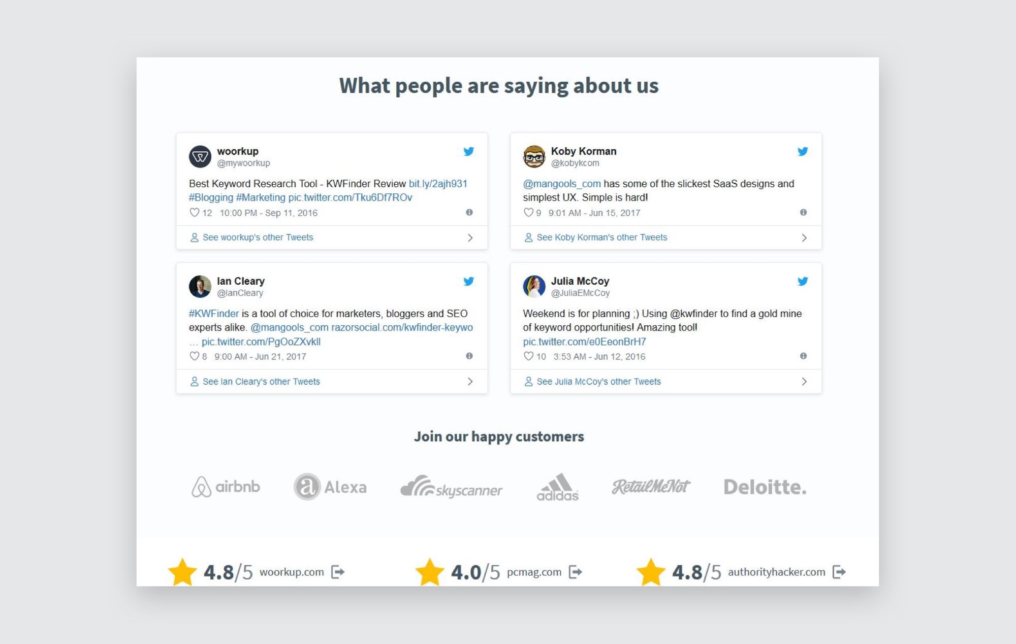
To really ace this tip, try getting video testimonials from happy customers.
8. Make Sure Your Ecommerce Landing Page is Mobile-Friendly
Mobile is the next big thing, and many of your future customers will be making purchases from mobile devices.
This is true even for B2B: one recent study found that 80% of B2B buyers use mobile at work, and 60% said they used a mobile device during a recent purchase.
So, making your landing page mobile-friendly isn’t optional anymore. If you want a high-converting page, you need to make it available for mobile.
9. Place High-Quality Images of Your Product Throughout the Page
People want to know exactly what your product can do. If you’re selling a hairdryer, people need to see what it looks like close-up. If you’re selling online software, the same principle applies.
So, instead of filling your landing pages with images like this...
...place high-quality, in-use pictures of your product throughout the landing page, like this:
That way, you’re answering any questions your visitors may have visually. Bonus: this means you’ll need less text on your landing page.
To take this to the next level, you could create a video of your product in use. In fact, using videos on your landing page could increase conversion rates by up to 86%.
10. Give Customers the Option to Live-Chat
Sometimes, a visitor may have an important question that has a serious impact on whether or not they will buy your product.
If that information isn’t available on your landing page, what can they do?
That’s why giving visitors the ability to live chat with your company is so important. This allows them to find quick answers to their important questions without having to leave the landing page.
A live chat service on your landing page is even more important for big-ticket items or B2B sales, since these customers may need some extra convincing before handing over a lot of cash.
11. Avoid Smothering Users with Product Specs by Building Informational Pop-Ups
Your landing page needs to contain a lot of information. It has to have your essential product specs, as well as information about your company, testimonials, and perhaps even a form for visitors to fill out.
So, how can you cram all of that information into one page without overwhelming visitors visually?
It’s time to let your web designers get a little fancy. Instead of presenting all the information at once, include hidden elements such as collapsible content and pop-ups.
For example, check out how this landing page hides its form:
Where’s the form, you ask? Just click on any of the CTA buttons and this form slides out from the right side:
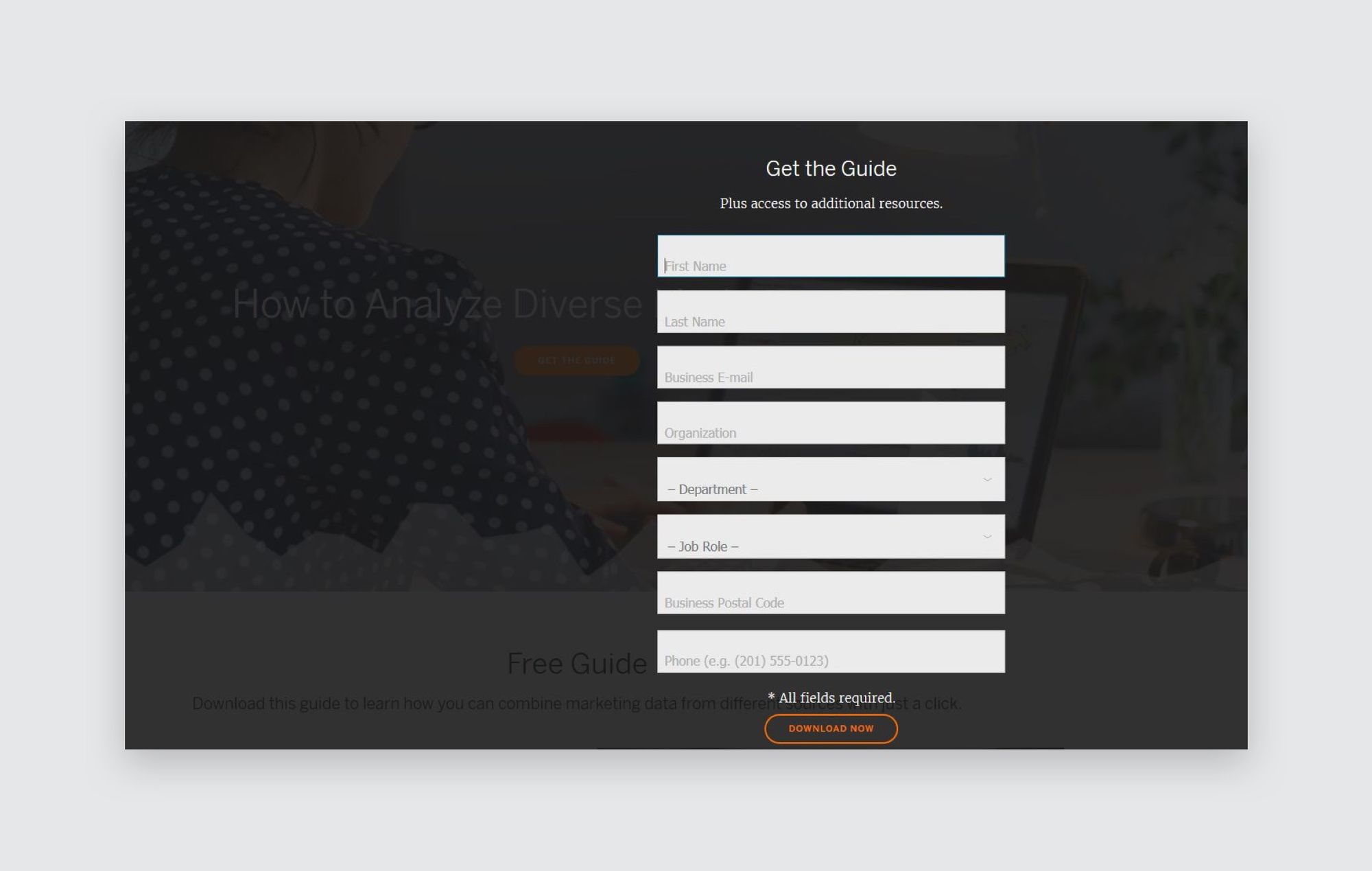
This is a great way to hide important elements of your website so that they don’t clutter your visitors’ first glance over the page.
12. Leave Plenty of White Space
Following the same idea of removing clutter, it’s important to leave white space on your landing page.
What does this mean? Basically, that some of your landing pages should be blank, without any text or images.
Check out this landing page from Webprofits:
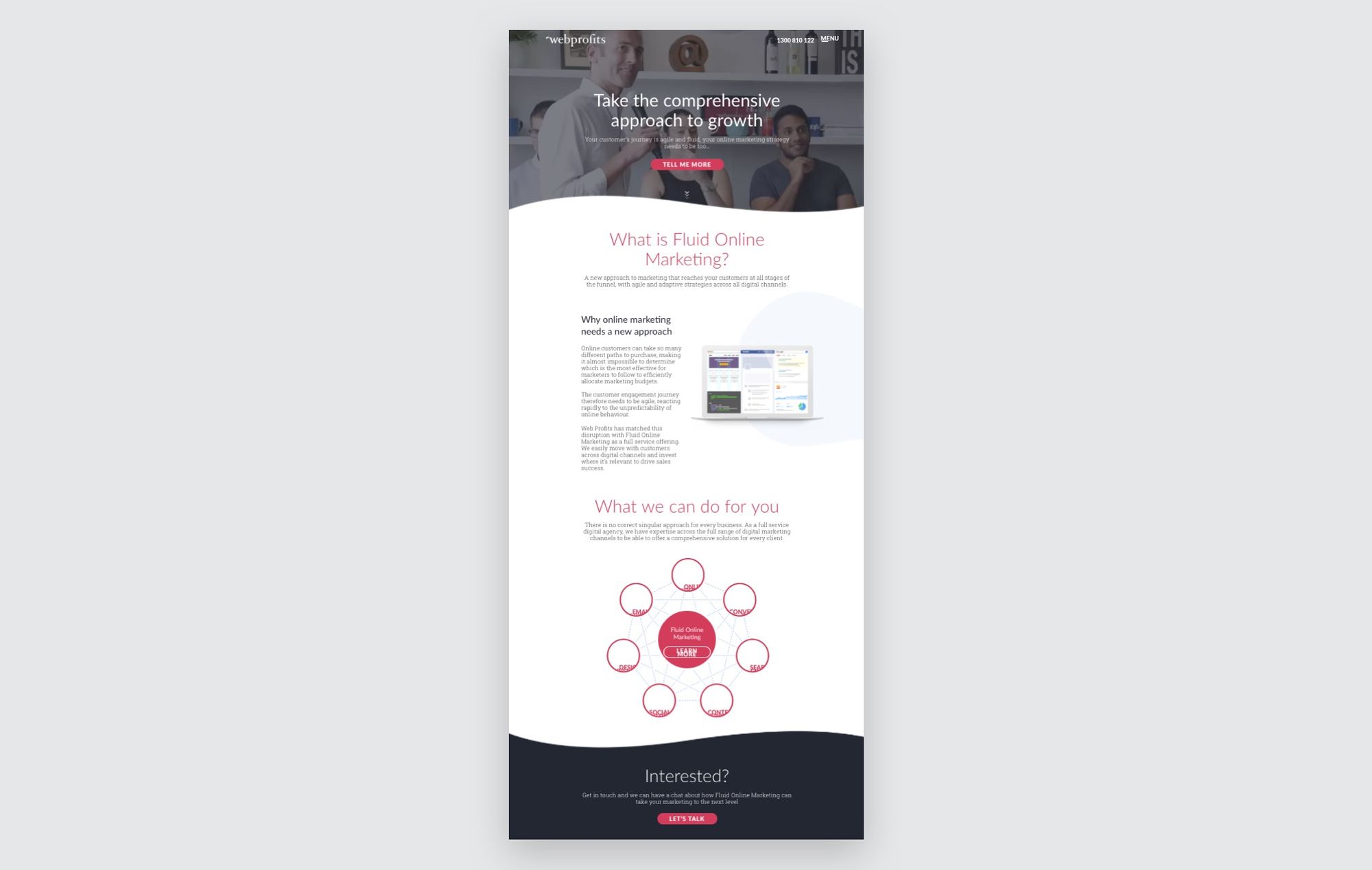
Even though this landing page is somewhat long, it doesn’t feel busy or overwhelming. The white space in between each point makes it easy for the visitor’s eyes to skim the information and learn enough to take action at the end.
13. Make Your Landing Page Secure
Security is becoming an ever more important issue these days. How can you make sure visitors feel safe when purchasing from your site?
To start, you’ll need to make sure you enable an SSL certificate on your website. This ensures security for purchases on that domain.
Next, you may want to consider adding security badges on your landing page, to show visitors that your company is legitimate and secure. Adding a privacy policy under any forms you ask visitors to fill out is also a good way to make users feel like their personal information is secure.
Lastly, including some kind of guarantee for your product helps visitors feel safer when making a purchase.
14. Track Your High-Converting Ecommerce Landing Page to Narrow in on What Works
Now that you’ve implemented a bunch of new ideas on your landing page, is it ready to convert?
Hopefully, yes. But don’t forget that these variables will affect each individual landing page in different ways.
That’s why it’s so important to A/B test your landing pages. In one highly-referenced study, former President Obama was actually able to raise $60 million by A/B testing elements on a landing page.
So, once you’ve secured the basics, try testing the variables on your website one-by-one. See which CTA button gets a better response, or whether a picture or video testimonial seems to work better.
Watch your conversion rate rise and fall, and then hone your landing page to turn it into the best possible version.
Conclusion: Is Your Ecommerce Landing Page Ready to Convert?
We’re hoping you give a big fat YES to that question.
Using these 14 steps, your landing pages will become more visually appealing to visitors, as well as more convincing.
When you implement these methods on all of your landing pages, you’ll finally reach the conversion rates that you’ve been expecting.